7 Best Practices for Creating Impactful Email Templates in Salesforce Lightning Experience

The success of email marketing depends on the subscriber being willing to engage and interact with the message, which starts with how an email looks.
Will it make the recipient sit up and take notice? Will they keep scrolling beyond the fold, expecting something more, or enjoy new visuals, images, and content surface above the fold?
You can make this happen and also be certain that it’s going to work, as the Salesforce Lightning Experience was built to that end. In this post, we are going to look at the seven best practices for creating and maximizing the impact of Salesforce email templates.
Email Template Width
The standard width of the model should range from 600px to 800px, which enables you to preview the email for most clients. If you are custom-coding it, follow these steps to change the width of the design:
- Log in to Data Loader and click Export All.
- Click Show All Salesforce Objects, select the Email Template object, then press Next.
- Now click Select All Fields and then Finish. Now you can open the file in a CSV tool, and standardize the width.
- Find the ‘HTML VALUE’ field. That’s the field you want to modify its breadth.
Note that 600px-800px is the average desktop breadth.
Maximize Readability
The title font size should be kept at 220px at least and as far as the body copy is concerned, we recommend a range of 12-14px for mobile and desktop viewing.
Keep in mind that the font size varies for the type you use, as not every two styles respond alike to the same size.

Whatever your typeface, it should be sans serif for the body copy, such as Times New Roman, Arial, Verdana, Georgia, etc. If you want to use serif fonts, we recommend limiting it to headings and such.
Line spacing should be 1.5 times the font size.
Use Single-Column Layouts
It’s typical of email marketers to seesaw between single- and double-column layouts. Which is the better choice? More often than not, the single-column layout is better.
Firstly, it uses a clean hierarchy, pushing the weightier, more necessary parts of the content upward, which ensures standard scrolling. Second, it is optimized for mobile viewing.
Because it is hierarchically sound, a single-column layout allows the subscriber to reach the CTA at just the right moment. Finally, it renders quickly.
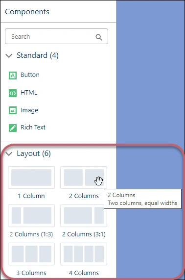
How do you do it in Salesforce? Just go to Email Template Builder, choose a layout, and then drag it to the canvas, as shown in the following screenshot.

Limit Image Use in Email
Now, it’s not a ban on picture usage, and the word “limit” is not to be exaggerated. Depending on the brand identity, you may need to include several pictures in the electronic mail. If you are an e-commerce brand, including nice product images is non-negotiable.
Only make sure it doesn’t affect the load time too much, and add relevant alt-texts to every pic.
Did You Know?
Salesforce Facilitates Nearly 13 Billion Interactions in a Day.
Make CTAs Prominent
The CTA button is among the most vital components of the template, therefore, you need to make sure it’s prominent, rightly positioned, and well-padded. Remember to take care of these for both mobile and desktop interfaces.
We recommend a minimum size of 44x44px for the CTA button and 16px at least for the text within the button. Learn how to add buttons in the interface right here.
Leverage White Space
Clean is queen. Make good use of white space (also known as negative space) around pictures and content elements so that the model doesn’t look cluttered.
Your electronic mail is not just a visual experience; it is ultimately intended to inform, not entertain, though it’s vital. White space draws the subscriber’s attention to the vital informative aspects of the email.
Test Your Email Template
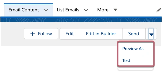
Make sure to test it before sending it and try it out beforehand in the interface. Choose the template and click the Send dropdown, where you should see both Preview and Test options, as shown here.

Now, keep in mind that in this system, Send Test and Verify Merge Fields options are not available, where you can only have a sneak. Also, if you are creating a model from the Email Template object, the above two options are not available in this interface, and no preview either.
N.B. As per Salesforce, Pardot users who have access to Drag-and-Drop Content Builder and Manage Email Content user permissions can preview and check it out. You would also need the Pardot permissions to View Prospect and View Segmentation Lists.
Wrapping Up!
Salesforce Lightning Experience was built to make it easy for marketers to build email campaigns more quickly and more efficiently. Yes, it might seem a bit convoluted at first, but over time you realize it’s quite intuitive and light.
Also Read: Email Security Protocols Every Business Should Implement


