Which Aspects of UI And UX Design Require The Most Attention?

The design elements UI and UX are often used interchangeably but are slightly different from each other. Their key aspects focus on user experience – UX with designing intuitive interfaces and UI to create visually pleasing interfaces.
Development teams often face the challenge of returning an application to the UI and UX design phase. Such modifications greatly delay and increase the cost of the product development process.
If you are thinking about developing bespoke software solutions and want to know about possible mistakes that need attention at the UI and UX design stage, this article is for you.
What Mistakes Make It Necessary to Redo The UI And UX?
The main mistake that developers face while designing the interface of any web or mobile application is working on the core scenario and ignoring the edge scenarios. Because of this, the main script may go to a dead end or crash the entire application.
Why is this happening and can this be avoided by working with a company that provides bespoke software solutions?
To qualitatively and fully design the user interface and experience, taking into account all edge scenarios, clarify during design:
- Exchanged data between client and server.
- Events after which data on the screens should be updated.
- Context of the screens (some screens should show content to the user, others should collect data from the user, others should show downloads, etc.).
To do this, it is relevant for the analyst to understand:
- What is a system?
- How is architecture built?
- How does client-server interaction work?
- What is API?
- Highlight to the designer the impact of system architecture and integration on the interface.
Interaction of Systems
Before looking at what errors can come from the server, it’s worth talking about how and why systems as a whole communicate with each other.
Firstly, they do this to obtain the data they need to process and use. And further send reports to other systems, for example, for external processing or subsequent use.
Most often, this communication occurs using an API – a special contract that is used for interaction between systems.
At the design stage, a list of systems with which integration should be built is determined, and a list of data that they will exchange.
THINGS TO CONSIDER
Studies prove that a well-designed UI can raise your conversion rate by up to 200%. An improved UX design can boost conversion rates by up to 400%.
Processing Server Responses
It is a good practice to limit the request execution time on the client and server sides to create a positive experience.
There is a possibility that the request may simply not be completed. In this case, the user will have to wait a long time for data to load or for an action to complete.
Redirecting Requests
To understand why edge scenarios occur, it’s worth noting that requests can be redirected. These are temporary or permanent measures caused by changes in the address of resources, system elements, etc.
When designing UI/UX, consider the request processing time and communicate to the user that they need to wait. That is, the client sends a request to the server to receive the response: “Wait.”
Usually, the server cannot tell you exactly how long you will have to wait. Therefore, developers need to think about the rational amount of waiting time after which an error will be shown to the user.
Client Errors
Both participants in the connection are responsible for client errors: both the client and the server. Errors on the client side include:
- An incorrect request is sent (400)
- The authorization token does not work (401)
- Insufficient rights to use a service or function (403)
- The requested resource no longer exists (404)
When an error occurs, developers need to show it to the user and explain further steps to fix it.
It is a good practice to put values and descriptions of errors on the backend so that the front end can correctly determine the cause of the error and display it in a readable form for the user.
At the initial stages of development, it is useful to display error codes for debugging features – so users can see what went wrong.
The error code does not carry any useful information for the user, but the developer needs to understand the error that has occurred.
Server Errors
The main error of the server is that requests are sent to it, but it does not respond. The only way out is to wait for it to update.
In the meantime, developers need to inform the user about the problem and ask him to repeat the action later.
Do not allow the user to analyze the system and block his further interaction with functionality that depends on the requested data.
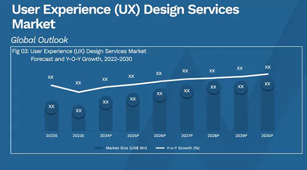
The graph below shows the importance and benefits of UX design services for improving user experience. The global market size of its usage has been growing rapidly since 2022 and is forecasted to improve till 2030.

Sending a Request to The Server is Not Necessary
Separately, it is worth paying attention to error handling that does not require receiving a response from the server.
For example, comparing values or validating fields – all this happens on the front end.
The received data from the server can be displayed anywhere in the application, depending on its type and the designed UI. Therefore, when designing, it is necessary:
- Consider the correspondence between UI elements and data types.
- Provide loading indicators as data updates or screen transitions occur to inform the user that it is loading.
- Display hints in error scenarios (client or server), as well as block (at least partially) further interaction with the system or notify the user about the need to repeat the action.
- Display notification after a long data load in scenarios when the response timeout has been exceeded.
Working With Data
Caching and the WebSocket protocol are technologies that require special attention in the early stages of system design because they can significantly affect the UI and UX.
Despite the attractiveness of data caching, this technology must be used carefully. A cache is a fast-access intermediate buffer that contains information that is most likely to be accessed. The client can use these values for reports that do not require frequent updates.
Final Thoughts
UI and UX design is a necessary and complex process that requires maximum attention in the initial stages. This allows you to avoid many mistakes, some of which we discussed in the article.
If you dream of developing a high-quality web project and are looking for a company that provides bespoke scalable software solutions, we recommend paying attention to Join.To.IT.


