5 Common Mistakes with Startup Website Designs and How to Avoid Them
Jump To Key Section
- Neglecting the Importance of Website Loading Speed and How to Avoid it
- Ignoring the Startup Website Homepage Design and Its Impact
- Failure to Utilize the Right Web Design Tools
- Overlooking the Necessity of a Mobile-friendly Website
- Misallocating the Web Design Budget and How to Rectify it
- Avoid These Mistakes with Startup Website Designs
What if the very design of your startup’s website is hindering its success? Studies reveal that users leave a page if it takes longer than three seconds to load, reducing potential customer engagement and conversions. In this digital realm, first impressions are vital, and avoiding the common mistakes with startup website designs can significantly boost your online presence.
This article will unveil five such design errors that often go unnoticed, along with effective strategies to dodge them. Your web page is the virtual storefront for your brand – it’s high time to ensure it stands out.
Neglecting the Importance of Website Loading Speed and How to Avoid it
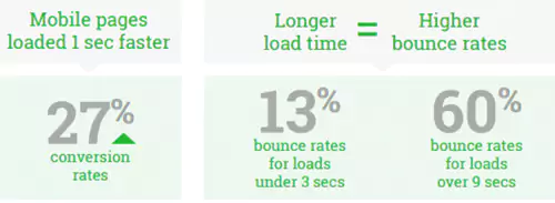
Website loading speed is a critical aspect that many startups overlook. Imagine a potential customer landing on your web page, only to leave because the site took too long to load. Customers tend to lose their patience which results in losing all the money. Fast site speed has higher conversion rates and low bounce rates. To avoid this issue, regularly check your website’s speed using online tools.
Heavy images and videos can often slow down a site. Hence, ensure they are optimized for quick loading. You can use various free and paid software for the same. The lesser the delay, the higher the user satisfaction.
Ignoring the Startup Website Homepage Design and Its Impact
Your startup website homepage is essentially your business’s front door. It’s often the first impression for potential customers, so it needs to make a statement. Sadly, many startups undervalue this aspect. A cluttered homepage or confusing navigation can push away visitors, so focus on creating a clean, user-friendly design.
Depending upon the number of pages, make a layout that is easier to navigate. For instance, you can go for grouping them according to the hierarchy or as per the requirements. The homepage design also depends upon the device. If you are using a mobile phone, the hamburger menu is the best choice as it works great for smaller screens. Highlight key features of your business and provide clear navigation to other pages.
Failure to Utilize the Right Web Design Tools
Many startups fail to take advantage of these available tools. There’s a misconception that a great outline must always be pricey. This is not true. Many affordable or even free design tools can help startups create professional-looking websites.
Consider platforms like Canva for graphics or WordPress for site building. They’re user-friendly, versatile, and perfect for those with a tight budget or limited design experience.
Overlooking the Necessity of a Mobile-friendly Website
In today’s tech-driven society, people spend a significant amount of time on their smartphones. Yet, many startups forget to plan their websites with mobile users in mind. A mobile-friendly website is no longer optional; it’s a necessity.
A site that isn’t optimized for mobile can lead to a poor user experience, potentially driving away a significant chunk of your audience. Therefore, always ensure that your site is responsive and delivers a seamless experience across all devices. A responsive website is best for both desktops and smartphones. The reason is that the content and information remain the same no matter what device you use. The site accordingly changes its appearance as per the device.
Misallocating the Web Design Budget and How to Rectify it
Finally, let’s talk about its budget. Allocating funds wisely is crucial, especially for startups where resources may be limited. Avoid overspending on unnecessary flashy designs.
Instead, focus on functionality and user experience. And remember, professional help doesn’t have to cost a fortune. You can find web developers from FreeUp, for example, who can assist in creating an effective and appealing website without breaking the bank.
Avoid These Mistakes with Startup Website Designs
Avoiding these common mistakes can make a difference between a website that merely exists and one that converts, engages, and outperforms. When built correctly, your site can become a powerful business tool, opening new avenues for growth.
Don’t let overlooked design elements obstruct your path to success. Utilize the knowledge you’ve gained here and take your startup’s online presence to new heights.
Interested in more insights for your startup? Continue your journey of discovery on our blog.
