8 Essential Features of an Effective Web Accessibility Solution for Online Retailers

The internet connects people from around the world. It makes accessing products, services, and information easier than ever.
On the other hand, the cornerstone of any company’s digital presence is its website. It successfully offers an inclusive digital experience.
Today, web accessibility is more significant than ever. Online retailers started prioritizing web accessibility. Why? It is not only beneficial for ethical reasons but also comes with the capability to target a huge untapped audience.
Remember, having an aesthetically pleasing website isn’t enough, customers expect a lot more. It could be either customer friendliness or how functional the site is. Failing to stand on their hopes, customers may click off your site and head to a competitor.
Figuring out which is worth your time and resources can be difficult. Companies like accessiBe have developed solutions to improve web accessibility
Also, we are here to help you out.
In this guide, you can look at 8 indispensable features of effective web accessibility solutions for online retailers.
User-Friendly Navigation
Web accessibility isn’t optional; it’s a must-have. A website with intuitive navigation ensures barrier-free navigation for users with motor function and vision difficulties.
With user-friendly navigation, users can quickly reach the content they want and will enjoy a seamless user experience.
The key aspects comprise:
- Keyboard Navigation: See if the site is navigational when using the tab and arrow keys. Also, it can be accessible even with alternative hardware such as a mouth stick or single-switch input.
- Clear Menu Structures: The site must be designed in a way that organizes website content logically.
Fast Fact:
It is found that 71% of disabled customers with access needs will leave a website they find difficult to use.
- Consistent Layout: Consistent layout and design across all pages reduces cognitive load. Particularly for those with cognitive disabilities.
Customizable Visual Experience
Yet another aspect of making a site more accessible is a “customizable visual experience”. Visual presentation can engage users for a while or a long time. You can consider to add features like:
- Font Size Adjustments: Include font size adjustment tools or options within the website interface. This can be achieved by ensuring the layout is responsible so the text and elements adjust accordingly.
- Color Contrast Options: Offer multiple color contrast options and make sure to implement a high contrast mode.
What did it do? It switches the site’s color scheme to high contrast with strong color contrasts between text and background.
- Text-to-Speech Functionality: TTS functionality allows users to listen to the content instead of reading it.
Again, this can be helpful for users with visual impairments or reading difficulties.
Content Clarity and Readability
Consider the full scope of an audience when drafting your content. Avoid using highly technical jargon and regional slang.
Also, consider including these elements to prioritize content clarity and readability:
- Plain Language: Text clarity is all about reinstating the readability and legibility of the text. Be simple, straightforward, and precise.
- Alternative Text for Images: Include descriptive alternative text (alt text) for all images. So, users with limited or impaired vision can understand the image through the use of a screen reader.
Additionally, Alt tags contribute to a higher SEO score on Google.
- Clear Headings: When organizing content use clear headings. For instance, h1 for main headings, h2 for subheadings, etc.
Responsive and Adaptive Design
To make the site responsive and adaptive, adopt diverse design techniques. This will make the site aesthetically pleasing and function well across different devices and screen sizes.
Do You Know?:
Online retailers in the UK lost up to £11.75 billion due to a lack of web accessibility according to a study.
Its major elements include:
- Fluid Grid Layouts: It uses proportional sizing instead of fixed pixel widths, so users can resize and reflow to fit different screen sizes.
- Flexible Images: It prevents distortion on different screen sizes. Use CSS max-width: 100%. With this, images scale down proportionally within their containers.
Multimedia Content Accessibility
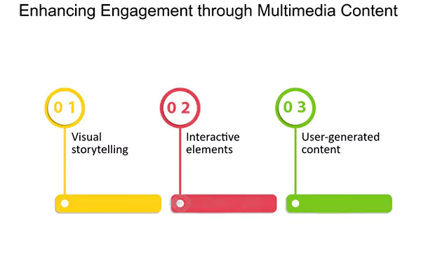
Implementing controls for web-based audio/video shouldn’t be a problem, right? It can enhance user experience. Here is how you can do it:
- Captioning for Videos: For any multimedia presentation, synchronize equivalent alternatives like captions for the visual track. It is suitable for people who are deaf or hearing impaired
- Descriptive Audio Tracks: Use audio descriptions synchronized with the main soundtrack of the media clip.
Ease of Interaction for All Users
All interactive elements need to be accessible. Web designers and developers can use usability processes, methods, and techniques from forms to buttons to link interactions.
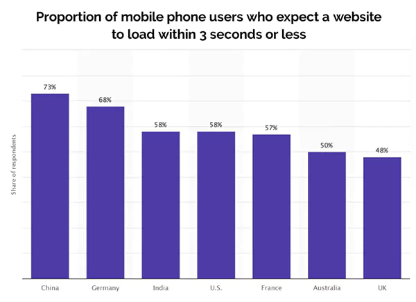
Statistics:
Poor loading speed can aggravate impressions and engagements.
Similarly, 73% of people in China, 68% of people in Germany, 58% in India, 58% of people in the US, 57% in France, 50% of people in Australia, and 48% of people in the UK expect websites to load within 3 seconds.
The key considerations are as follows:
- Clear Form Labels: Descriptive and concise labels for all form fields let users know what is required and how to provide it. Also, use asterisks (*) for required fields.
- Error Identification and Easy Correction: The site must notify users with clear error messages. It can precisely describe the issue and offer direction on how to correct it.
- Accessible Buttons and Links: Buttons and links should be visually distinct and easily recognizable. You can even allow users to interact with them using the Tab key.
Continuous Accessibility Maintenance
Just like diversity training and culture, accessibility is not a “one and done” undertaking. It is an ongoing commitment.
Maintenance won’t stop the site from working, even when the content and technologies change.
Key strategies to ensure the same are:
- Regular Accessibility Audits: Conduct regular accessibility audits to identify barriers.
Interesting Fact:
As of October 2023, the global internet user count stood at 5.3 billion individuals. The numbers are equivalent to 65.7% of the world’s population.
You can even get assistance from experts having great knowledge of Web Content Accessibility Guidelines (WCAG).
- User Feedback: User feedback encourages users to come forward and report accessibility issues (if any) they encounter.
Creating an Inclusive Digital Shopping Experience for All Users
A retail organization that is constantly rotating product pages on its website must consider making its site accessible.
“Good design is a lot like clear thinking made visual”, says Edward Tufte (American statistician and professor).
Now that you have an idea of the essentials of a stellar website, it’s time to get building.
Don’t make something unless it’s both necessary and useful!
-Sponsored by accessiBe
