7 Tips For Designing A Memorable Logo
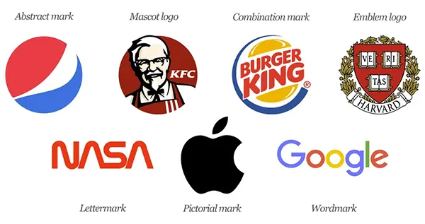
Designing a memorable logo is a journey that requires creativity, strategic thinking, and a profound comprehension of your brand’s essence. It’s the visual foundation of the brand, offering a first impression that can either captivate or elude the target audience.
Creating a unique design is more vital than ever in a world saturated with imagery. This task goes beyond crafting an attractive design; it’s about creating a symbol that reflects your company’s core beliefs, values, and ambitions.
This article provides helpful tips to navigate the intricacies of logo creation, ensuring your emblem resonates with your target audience and withstands the test of time.
Understand Your Brand Inside Out
Before sketching potential logos, it’s vital to have a comprehensive understanding of the brand you’re designing for. This involves more than familiarity with the products or logo design company London services offered; it’s about comprehending the brand’s fundamental values, mission, and character.
Reflect on what distinguishes the brand and how you wish it to be perceived by the audience.
These experts can assist in distilling the essence of the brand into a visual representation, ensuring it is visually appealing and significant. Understanding your intended audience is necessary.
Your icon needs to appeal to the individuals you aim to attract, resonating with their preferences, requirements, and values. This in-depth analysis of your company’s and audience’s psyche lays the groundwork for a logo that genuinely connects and endures.
Simplicity Is Key
The most impactful logos are often the most straightforward. A clean, uncluttered design ensures your emblem is versatile, scalable, and instantly recognizable.
Consider the most iconic ones; they typically feature simple shapes and a restrained color palette.
When crafting the design, avoid the temptation to add unnecessary complexity. Each design component should have a purpose, enhancing the overall message the enterprise intends to communicate.
This doesn’t mean that the design should lack creativity or uniqueness but should be distilled to its required elements.
This concept also applies to choices in color and typeface. A restrained color palette and legible typography can make your emblem more adaptable and effective across a range of mediums, from digital displays to physical merchandise.
Interesting Fact
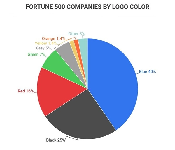
The above graph shows the data on the color of the logo of Fortune 500 companies. Around 40% of companies among them use blue color for their logo.
Typography Speaks Volumes
The selection of typeface in your emblem is as pivotal as the imagery. Font choice can convey the company’s personality, ranging from traditional and dependable to contemporary and avant-garde.
Each font style has its own character and emotional impact, so select one that resonates with your company’s voice. Opting for custom typography can differentiate the presence.
A distinctive font adds an original flair, making your emblem unique. Nonetheless, readability remains paramount; the text in the icon must be decipherable in various sizes and across different platforms.
The power of typography to tell your brand’s story should not be underestimated. The appropriate font can subtly convey your company’s values and ethos, adding depth and complexity to the emblem.
Color Psychology Matters
Colors have a significant psychological impact, shaping perceptions and emotions. When choosing colors for the emblem, consider the message and emotions the enterprise wants to evoke.
Each hue has associated meanings and connotations that can influence how your brand is perceived. For instance, blue is often associated with trust, stability, and professionalism, making it a favored choice for financial institutions and tech firms.
Conversely, green is linked to growth, health, and sustainability, making it suitable for brands in the wellness or environmental sectors.
Yet, it’s not solely about the inherent meanings of colors but also how they interact and contrast with each other. Ensure the color selections are harmonious, enhancing the emblem’s visibility and impact while staying true to the brand’s identity.
Integrate Flexibility And Scalability
A great logo performs well across different mediums and scales. From tiny mobile app icons to massive billboards, it should maintain its integrity and impact. This requires thoughtful consideration of its composition, ensuring it’s legible and effective at any size.
To achieve this, test the created design in various contexts during the design process. This includes monochrome versions, necessary for applications where color printing isn’t feasible. A versatile icon transcends constraints, adapting seamlessly to digital and physical applications.
Remember, a logo isn’t just a static image; it’s a functional part of the company’s identity. Its ability to adapt without losing its essence is key to enduring relevance and recognition.
DO YOU KNOW?
When BBC decided to change their old 1997 logo, it cost them around $1.8 million. It was created by Eric Grill’s type Gill Sans script.
Tell A Story
Your logo should do more than just look good; it should tell a story. This narrative can be literal, using imagery that directly relates to your brand’s products or services, or more abstract, capturing the spirit and values of the brand.
The most compelling designs often have a story behind them, adding a layer of depth that invites curiosity and engagement. This storytelling aspect can foster a stronger emotional connection with the target audience, making your brand more memorable and relatable.
Consider incorporating symbolic elements that resonate with the brand’s history, mission, or vision. These symbols can add richness to a logo’s appearance, making it a mark and a messenger of the brand’s unique story.
Seek Feedback And Be Ready To Iterate
Designing a logo is a process, not a one-time event. It’s necessary to seek feedback from various stakeholders, including potential customers, team members, and design professionals.
Different perspectives can reveal insights you might have overlooked, highlighting areas for improvement. Be open to constructive criticism and ready to iterate on your design.
This iterative process can refine the design, ensuring it represents the brand and resonates with the audience. Remember, an icon that works well for everyone involved is more likely to succeed in the long run.
The Bottom Line
Designing a memorable logo is a nuanced process that blends artistry with strategy. It’s about more than creating a visually appealing mark, crafting an emblem that encapsulates the brand’s essence and speaks directly to the target audience’s hearts.
A unique icon can be created by understanding your brand, embracing simplicity, leveraging color psychology, choosing the right typography, ensuring flexibility, telling a story, and valuing feedback that will stand out in the competition.Remember, a great logo is the beacon of your startup, guiding and inspiring trust and loyalty in an ever-evolving marketplace.

