How To Generate Leads With Opt-In Pages
Are you looking for ways to turn your web visitors into lasting customers? Do you seek a unique strategy to earn more value from your web traffic? If yes, opt-in webpages should be your go-to – it’s the best way to capture potential leads, get their email address, and get permission to market to them.
Building a quality email list is a significant thing, a growing business should do, and one fundamental way to capture leads is through opt-in pages.
By crafting the appropriate offer and strategically placing it on your website, you’re magically transforming your web traffic into contacts you can market to.
In this article, you’ll be enlightened on what subscribe pages are. You’ll also learn how you can generate leads with any opt in page example from the few discussed to draw inspiration from and also drive conversions. The better you optimize it, the more value you get from your hard-earned web traffic.
What Is An Opt-In Page?
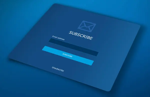
It’s a section separate from your website’s homepage or others; the subscribe area is solely created to encourage prospective customers to willingly share their contact information in exchange for an incentive such as a whitepaper, an eBook, a discount, or a coupon.
It typically requires your prospects to fill out their full name, email address, telephone number, and other necessary identifiers. You might ask why it is necessary – opt-in sections are absolutely vital because they help your online business grow.
The traffic on your landing site is valuable. The only way to harness that value is by getting key information about each of your website’s prospective visitors, and that’s where subscribed web pages come in.
Once you have your prospect’s information, you have a qualified lead to market to; scale it to your web traffic and see why getting a subscribe link is vital.
How To Create High Lead Generation Opt-In Page

Before we continue, here’s a question for you – how many times do first-time visitors on your website convert into high-paying clientele?
The answer might not be impressive, but thanks to subscribe pages, you don’t have to let your website’s traffic disappear into thin air. Read more here to discover how to use an opt-in webpage to grow your online business.
Give Attention To Your Subscribe Page Design
Boring designs do not inspire prospects to spend more time on your website. Most of its examples boost the confidence of prospective customers visiting their pages. Attention-grabbing design on them helps generate more leads for your business.
First, the design of it should be clear, concise, and easy to understand. To create an attention-grabbing subscribe section design, do the following;
- Work on symmetry and shapes
- Complement the colors of your theme
- The text should be bold and easy to read
- Differentiate your paragraph titles
- Use a compelling headline
- Concise and clear subheading
Value Preposition
Highlight the values your website first-time users will get if they give their contact information or sign up. This benefit could be a discount, free content, or another incentive; your potential customers should be able to see what value they will receive from your service or product.
All to do is focus on highlighting the benefits and strengths of your business; it’s an effective way to propel your prospective customers to try your services or products.
Work On Your CTA (Call-to-action)
One vital aspect of any subscription-based webpage is the CTA; it’s a part of the page that aims to trigger prospective customers into action.
It can be a link or a button encouraging prospective customers to submit their contact information without feeling pressured.
Your CTA should be distinct from the other information on the subscription-based page; it should stand out so they can see it. You can also include a strong directive, such as sign up or download for free.
Create A Sense Of Urgency
Creating a sense of urgency and scarcity is an excellent way to boost leads; its purpose is to push your website users to take advantage of a limited offer. This trick subtly compels them to take up the offer quickly, at the same time they also find out more about your business.
A Concise Lead Form
The lead form on your opt-in page is where your site’s visitors will input their contact information to gain access to your subscribe incentive or lead magnet. It should contain a field where you can enter their names, email addresses, and phone numbers.
Increasing the number of fields results in a lower subscription rate; the more information you ask for, the chances of them leaving your site becomes high.
Opt-In Page Examples To Draw Inspiration From
Opt-in forms are excellent tools that directly contributes to growing database. Here are 2 of its examples:
Backlinko Opt-In Page
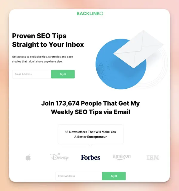
Backlinko is a popular online platform that offers detailed resources and in-depth SEO training to its customers. This example stands out because it features popular brand logos and social proof.
Inserting support from popular brands. This helps increase your brand’s authority and credibility.
Blue Apron Opt-In Page
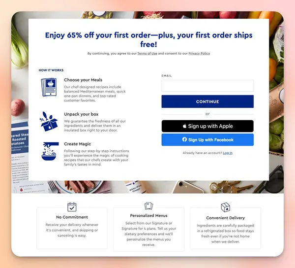
This stands out because of its clear and concise headline that offers a significant discount to incentivize prospects’ action; it’s direct, offering a compelling discount, which is one of the most active ways to encourage guests to sign up.
Also, its layout is clean, and it skillfully presents information and directs prospective visitors from the offer to the benefits and then the CTA option. It also highlights key benefits such as No Commitment, Personalized Menus, and Convenient Delivery
On A Final Note
One way to generate leads is by crafting the appropriate offer and placing your opt-in webpage in the right locations on your site; once all these are in place, you can transform your website’s traffic into mind-blowing leads.
Note—the better your business generates leads, the more it will keep growing and flourishing. Hopefully, these subscription-based webpage examples will inspire you to create unique and eye-catching subscribe section. Say yes to opt-in pages.


