6 Mistakes You’re Probably Making in Your Landing Pages in 2026 (and How to Fix Them)
Jump To Key Section
- Mistake No.1: Overloading Your Landing Page With too Many Elements
- Mistake No.2: Using Generic Content That Speaks to All Audiences
- Mistake No.3: Not Incorporating Relevant Videos or Images
- Mistake No.4: Using Unclear CTAs or Having Them Miss Entirely
- Mistake No.5: Having too Many Conversion Goals
- Mistake No.6: Not Including Social Proof
- The Bottom Line
- FAQs

In business, first impressions are last impressions. And this directly applies to a company’s landing pages. An attractive and useful page can make or break your traffic conversions.
Modern customers now have a smaller attention span window, and what doesn’t interest them instantly gets forgotten easily, leaving businesses scratching their heads on why the results are not translating despite honest efforts in building a landing page.
Let’s explore the mistakes that many brands overlook and how you can fix them and increase ROI.
Key Takeaways
- A cluttered landing page confuses visitors, undermining their interests and leading them to close the page in just a few seconds.
- Including relevant and high-quality videos and images on a landing page makes the user understand the scope of services and the value a product offers.
- Vague CTAs decrease conversions, as the user doesn’t see who to contact and inquire further for more assistance or information.
- Including the details of the firm, its way of functioning, and the experience it boasts are some of the great ways one can profit from toilet.
Mistake No.1: Overloading Your Landing Page With too Many Elements
A disorganized landing page confuses visitors and makes it very challenging for them to locate what they are actually searching for. Without a clear visual procedure, they miss the CTA and the value proposition, and that’s how you lose a customer.
Less is more when it comes to landing pages, so keep the design clean and build structure by placing elements in a way that guides people’s eyes from the headline to the images, supporting text, and CTA.
The best landing pages are easy-to-navigate, visually appealing, and conversion-focused, and they ensure customers absorb important information quickly without feeling overwhelmed. The result? You experience higher engagement.
Mistake No.2: Using Generic Content That Speaks to All Audiences
Trying to appeal to everyone, all at once, is a surefire way to lose attention immediately. Imagine if Adobe created a landing page for Photoshop and used a single page to appeal to schools, designers, publishing houses, and potential employees all at the same time. It would become a complete disaster.
Different audiences have different pain points and needs, and they require targeted messaging. You don’t want a landing page that speaks in vague, broad terms. You want a landing page that addresses intent, so visitors feel the content is relevant to them.
Here’s how you can fix it: create dedicated landing pages that speak to the interests of each segment, and personalize content based on behavior, demographics, or campaign source to improve engagement with your audience.
Mistake No.3: Not Incorporating Relevant Videos or Images
If a landing page is text-heavy and doesn’t include any engaging visuals, it can feel uninviting and fail to catch the attention of visitors. Also, you should avoid stock images. They’re overused and will make your brand appear untrustworthy and less authentic.
What people really need to stay engaged on the page is a visual representation of your brand, helping them understand your products and services while also empowering them to take action.
So, include high-quality videos and images, adding credibility to your offer, and support your message. This builds an emotional connection with those who visit the webpage.
You don’t have to fix this mistake manually (after all, your time as a business owner is precious), because a landing page builder simplifies the process as it offers drag-and-drop interfaces, and built-in media libraries to ensure you can create a visually engaging page without specialized coding or design skills.
Mistake No.4: Using Unclear CTAs or Having Them Miss Entirely
A landing page without a compelling CTA will leave visitors unsure of what action they should take next, so you will lose conversions.
If your CTA is hidden (or vague), people won’t take action because they won’t feel motivated. The fix? Use action-driven calls to action like “Claim your free trial” or “Get started now” and make sure they’re prominent.
Use strategic placement and contrasting colors, as these will help you draw attention, and repeat the CTA at various points in the page.
You should always prioritize customer emotions and use it increase the effectiveness of your CTA, and make use of words that convey exclusivity, problem-solving, or excitement, making a connection with people on a deeper level possible.
Fun Fact
Strong visuals in landing pages are key, as the human brain processes images in just 13 milliseconds.
Mistake No.5: Having too Many Conversion Goals
A landing page is designed with just one goal in mind: to drive conversions. So, if you include different conversion actions, such as downloading an e-book, signing up for a free trial, and buying a product, people will get overwhelmed (wouldn’t you feel the same?).
This is why you should keep the landing page focused on a singular objective, such as subscribing to a newsletter or booking a demo. Don’t use buttons that distract from the main objectives, because this can decrease the impact of the primary goal’s conversions.
If necessary, create a unique landing page for each of your business goals to maintain clarity, and make sure to use A/B testing to see which conversion goal performs best.
Mistake No.6: Not Including Social Proof
Your word is often not enough to convince people to take action. Imagine this scenario: you’re looking for a new dentist and visit the website of some local specialists you’ve found, which gives you an idea of the available hours, services, and location.
But as you look further, you come across hundreds of positive reviews from patients, which boost your confidence and make you click on that “book an appointment” button. The same is true when it comes to your business.
No matter how hard you work on your marketing copy to build trust among customers, at the end of the day, the content comes from you, and that’s not what people need. They need proof from those in the same situation as them to have faith in you.
In a landing page, you can add social proof by inserting genuine customer reviews and quotes showing the advantages and uses of your products.
Here’s a tip to attain the best results from this kind of social proof: Use quotes that get rid of hesitations related to your services and bust common myths. This makes a huge difference in the long-term.
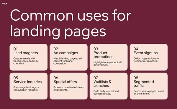
Also, check out this illustration to learn about the uses of landing pages and how they help out a business:
The Bottom Line
If you’re making these mistakes in your landing pages, you’re losing customers without even realizing it. There are millions of businesses out there vying for people’s attention, and as discussed, you only have a few seconds to convince people to sign up for your service or product. So, think strategically, and make sure to fix the mistakes we talked about.